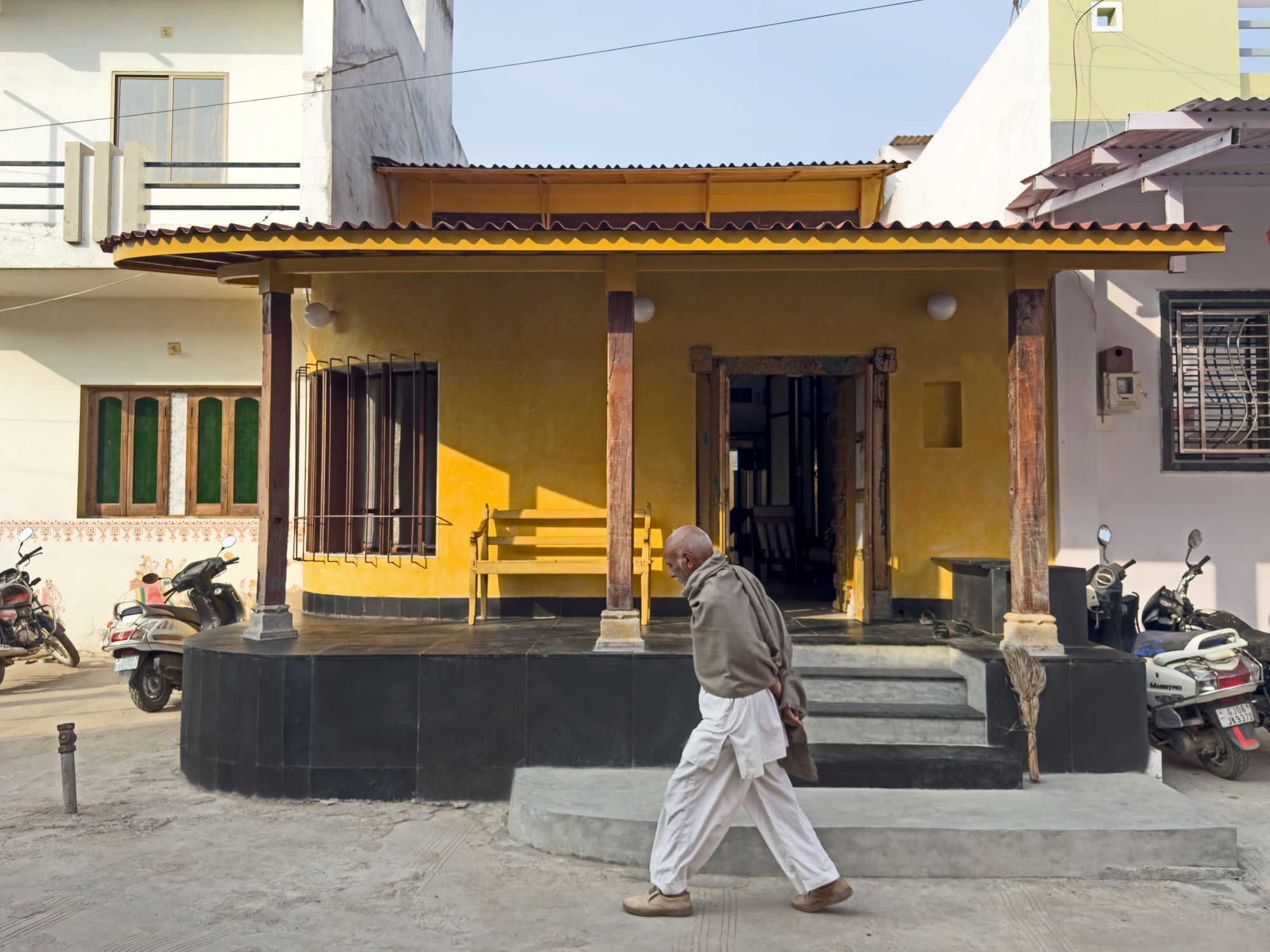
 Samskara – Made in India, Exhibition Gallery by Anupama Kundoo Architects
Made In… India is a new brand that presented its products in an exhibition in Delhi with a luxury-store look, starting with a reference to Indian culture but developing into a contemporary international concept. The exhibition was curated by BE OPEN – a cultural and social initiative that aims ‘to help brilliant young creatives to shape the future’ – and Sunil Sethi, President of the Fashion Design Council of India..

Made In… India is the starting point of the project ‘North/South/East/West’ which focuses on the interaction between cultures and creativity. The project investigates the survival of craftsmanship in an increasingly technological world, exploring traditional crafts as a way to develop new ways to approach the future, and ‘mixing crafts and design’

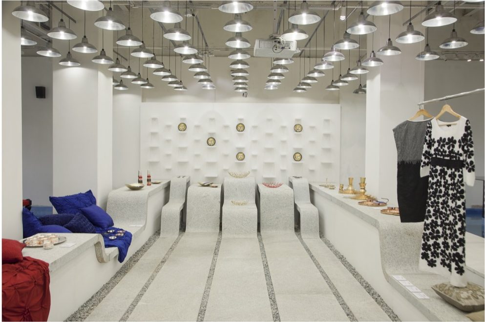
The 600 sq.m of gallery space displays around 200 objects designed by 26 designers. A substantial portion of the gallery has been designed as ‘surplus’ relief and circulatory space that contributes to the overall atmosphere of luxury, and features several water basins with bench-seating alongside them.
A key material used here is white granite with grey speckles, cut in large slabs and finished with traditional hand levelling techniques to reveal a more interesting texture and enhancing the natural material (in place of the usual current aesthetic of shiny, machine-polished, reflecting surfaces most commonly seen in hotel lobbies and such). The skills of a stonecutters’ community from Tamil Nadu lend themselves to produce a landscape of undulating floors, shelves and benches in solid granite that makes the flat and otherwise heavy material look fluid and elegant. The other key material is ferrocement – a more contemporary and sophisticated material, that is also essentially a hand-crafted element – used as slabs that are smoothly finished with waxed and coloured cement pigments in either off-white or turquoise blue.
The architectural elements – such as shelves – become part of a new undulating landscape that becomes the backdrop for the objects to be displayed, so that the designed products, including furniture, can be observed without competing with the installation design for attention. This design focuses on the negative space, which establishes the mood and the context for defining the brand image rather than being perceived as very ‘visible’ design. The only elements that are perceived as stand-alone objects are the designed products that are being exhibited.


To achieve a sense of broader spatial unity that imparts a strong and unique identity, continuity is established between the various architectural elements like walls, pillars, floors and ceilings. These are no longer perceived as separate elements but seen as continuous surfaces that flow into one another seamlessly, making these indistinguishable and indivisible into separate functional elements.

The materiality contributes to the spatial experience and recalls references to Indian culture in a contemporary application, with the focus on the particular crafting of the material rather than the material itself. Patterns and textures are not merely overlaid as if existing for themselves but strongly connected to the lines and surfaces that emerge from the spatial movement in a three-dimensional application.
The integrated approach to treating colour and texture is sober and quiet. Here – to establish luxury in the ‘Indian sense’ – there is richness in the tactile and textural treatments, bringing together diverse materials and crafts within a similar colour palette. The perception will be neutral (but embellished) when seen from afar, with the exhibited artefacts being the objects of focus; however as one approaches the surfaces, further patterns and textures appear so as to reveal new information gradually. This is not unlike luxurious embroidery in sarees or jewellery where the intricacy is revealed at an intimate close-up view. The overall patterns are perceived more as textures when seen from far keeping the focus on the essential forms that are simple to read. Various shades of grey are generated to a great extent by relying on the diffused light to create subtle shadows.


As the exhibition reveals the potential for luxury in craft, for me the real luxury is the sheer time devoted to the making process; neither the craftsmen nor the users have any sense that they are ‘wasting’ time.